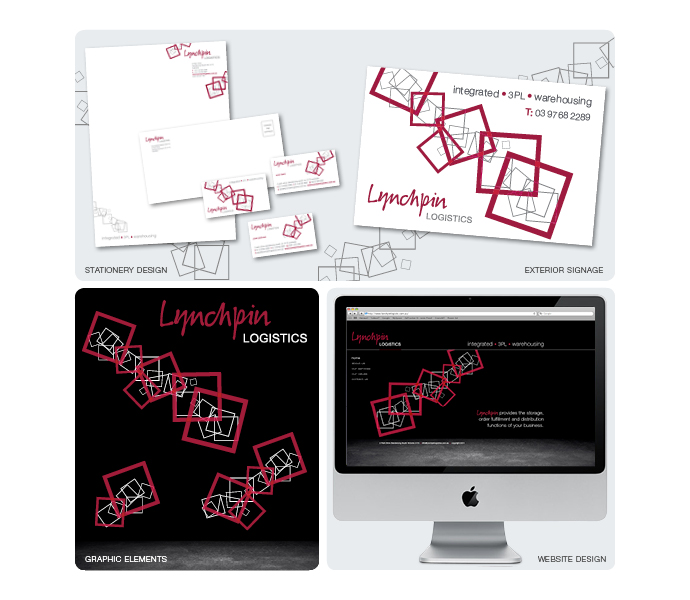
Lynchpin Logistics needed to develop a new brand to differentiate itself from its competitors, to move away from what is viewed as a very masculine, industrial environment and give themselves a fresh, modern look with a warmer touch.
Being a company that provides storage, order fulfillment and distribution functions for businesses, Lynchpin wanted to avoid using pictures of pallets, brown boxes and warehouse imagery, moving more towards an image that promotes them with a more modern, edgier look with a softer touch.
Lynchpin Logistics approached Alicia to have her create the new look and feel for their brand, giving her full control over the design, with the only request being to maintain the existing logo and incorporate the brand colours of red and grey.
Still working within the environment, Alicia put a modern twist on the approach to warehouse and fulfillment by removing the grey, cold feel of the cement and the steel construction and placing the designs in either clean, fresh white backgrounds or on strong, rich black backgrounds, with a softened hint of the cement flooring of the warehouse, which was used in the website design. The designs were energised with red, white and grey outlined ‘tumbling boxes’ with a graphical overlapping effect applied. Various graphic elements were created of the ‘tumbling boxes’ to be applied on black or white backgrounds, along with a watermark of grey tumbling boxes.
Alicia applied the new revitalized brand look across the board, creating new stationery, signage, document layouts and presentation folders, as well as designing the frontend of their new website.
Lynchpin Logistics
- Categories →
- Branding
- Design
- Digital
Portfolio
-

NAB Agribusiness

-

AXA Financial Services
-

Symbion Pharmacy Services
-

The Guild Group
-

Lynchpin Logistics
-

Kando Dental
-

HESTA
-

Black Elefant
-

SEEK
-

Diversified Exhibitions
-

Department of Education and Early Childhood Development
-

Australian Red Cross
-

Elgo Estate Winery
-

SAS Hairdressing
-

Kérastase Paris
-

Matrix
-

Robina Town Centre – Fashion
-

Robina Town Centre – Christmas
-

Eastland Shopping Centre
-

Eastland and Watergardens